May is my favourite month in the Stampin’ Up! calendar and is when being a demonstrator really is the most fun. During May we have the retiring list which brings out the need in me to clear out the cupboards and that’s when you find those hidden gems which you’d forgot you bought but absolutely love, which brings on a whole wave of creativity. BUT that is not the best part, the best part is the pre-order list and being able to see the catalogue a month early (its amazing). The pre-order list means we can order a selection of products early and always (or has done as long as I remember) included the brand new in-colours and this to me is absolute heaven when that box of new coloured goodies arrives on the doorstep. This year we have five amazing new colours which I’m sure you’re going to love as much as I do. I’m sure you’ve seen three of them in the Eastern Palace Suite but here is a picture of all five together…lush.

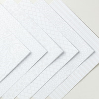
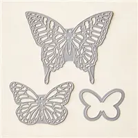
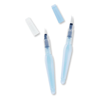
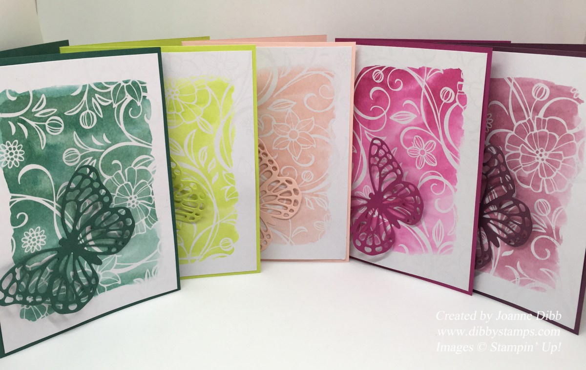
These cards were super quick to make and use a combination of retiring products, staying products and new products. The background paper come from the Irresistibly Floral dsp paper which is sadly retiring, but currently still available to purchase. I just used the aqua painter and the new in-colour inks to create a wash over the top and just embellished with a simple butterfly cut from the Butterflies Thinlits dies. Now lets take a closer look at each card.

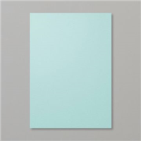
This card features Tranquil Tide which is a gorgeous rich green which is darker than Emerald Envy and a greener version of Island Indigo. I can see myself using this colour lot as its a shade of green I’ve being longing for.

This card features Lemon Lime Twist which is quite unlike any other colour in the Stampin’ Up range. It’s an almost neon its so bright ( much brighter than in the photo) and I think it will look gorgeous paired up with black and any of our pinks.

This card features Powder Pink, yes it is very similar to Pink Pirouette and Blushing Bride but it works beautifully alongside both colours and is the perfect baby pink colour.

This card features Berry Burst which is a lovely Magenta colour with a similar brightness to Lemon Lime Twist I can see this working well with many of our colours as its has just a bit more zing than Melon Mambo or Rose Red.

This final card features Fresh Fig which I think is my favourite colour. It’s a lighter version to Blackberry Bliss which I loved but did find a little too dark for some projects. Fresh Fig for me is the perfect purple and I’m already wishing I’d ordered more in my pre-order.
If you think you’d like to get your hands on these products earlier than June 1st then I’d love you to join my team and then you too can order from our pre-order list and enjoy these wonderful products a little early.
Thanks for stopping by.
Happy Crafting
Joanne x